WT Categories Carousel for WooCommerce
Using this plugin, you will be able to create customised and responsive WooCommerce categories carousels and show them on anywhere using Shortcodes.
Download and Install:
- Login to your account at this website and navigate to ACCOUNT -> My Downloads page
- Download WT Categories Carousel for WooCommerce plugin to your pc
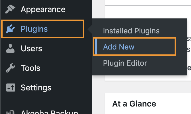
- Login to your WordPress Admin
- Click on Plugins -> Add New from WordPress admin sidebar menu
- Click on Upload Plugin button
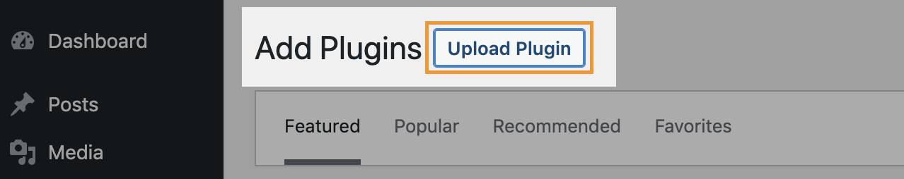
- Click on Choose file button -> Select the plugin zip file you just downloaded -> Click on Install Now button.

Add Subscription API Key:
Add the Subscription API Key, so you will be able to update this plugin from your WordPress admin whenever new version available within your subscription period.
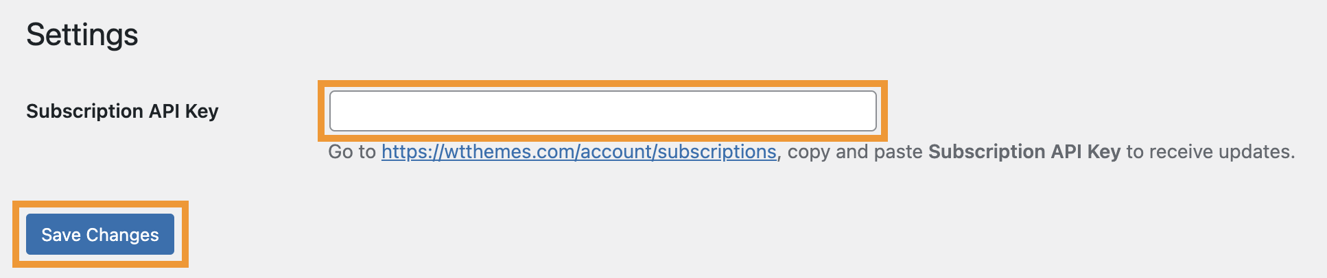
- Login to your account at this website and navigate to ACCOUNT -> My Subscriptions page
- Select and copy Subscription API Key:
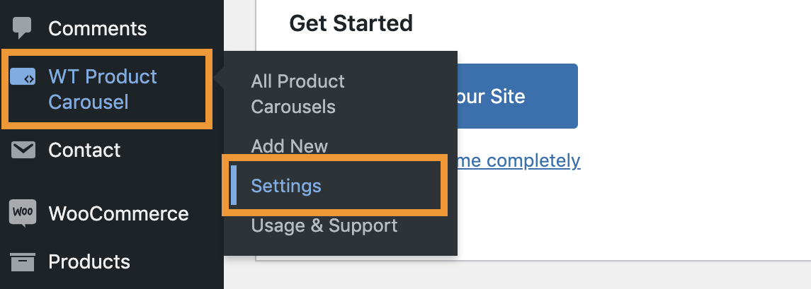
- From the WordPress admin, click on WT Categories Carousel -> Settings from WordPress admin sidebar menu
- Paste the Subscription API Key you just copied on Subscription API Key field and click on Save Changes button.
Create Product Carousel:
- From the WordPress admin, click on WT Categories Carousel -> Add New from WordPress admin sidebar menu
- From next screen, add a title to identify the categories carousel later.
Shortcodes
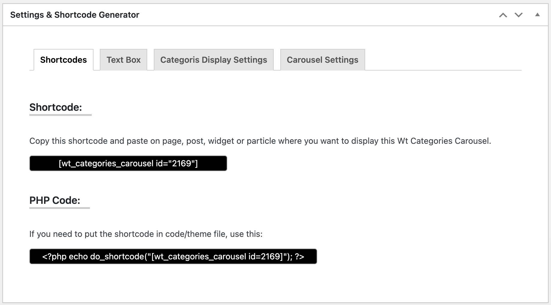
Copy Shortcode showing on this page and paste it on Post/Page/Widget or Gantry 5 Particle where you want to show this Categories carousel.
Configurable Options: Text Box
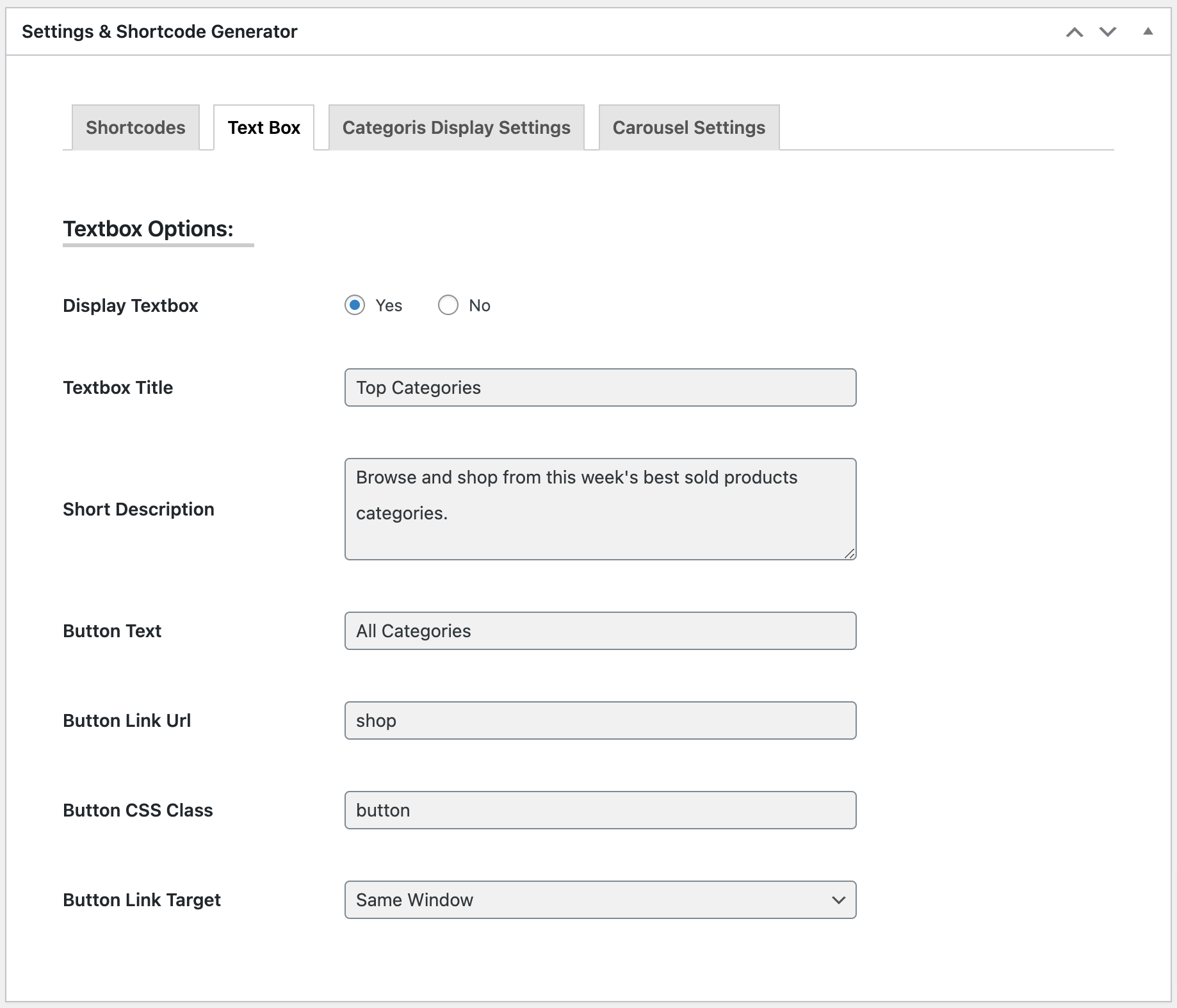
| Textbox Options: | |
| Display Textbox | Show/hide text box. |
|---|---|
| Textbox Title | Write text box title. E.g. Popular Categories |
| Short Description | Write short description. |
| Button Text | Write button text. E.g. All Categories |
| Button Link Url | Enter full URL or page slug to navigate after clicking on the button. |
| Button CSS Class | Add CSS class to style the button. |
| Button Link Target | Select whether the page open at the same window or new window after clicking on the button. |
Configurable Options: Categories Display Settings
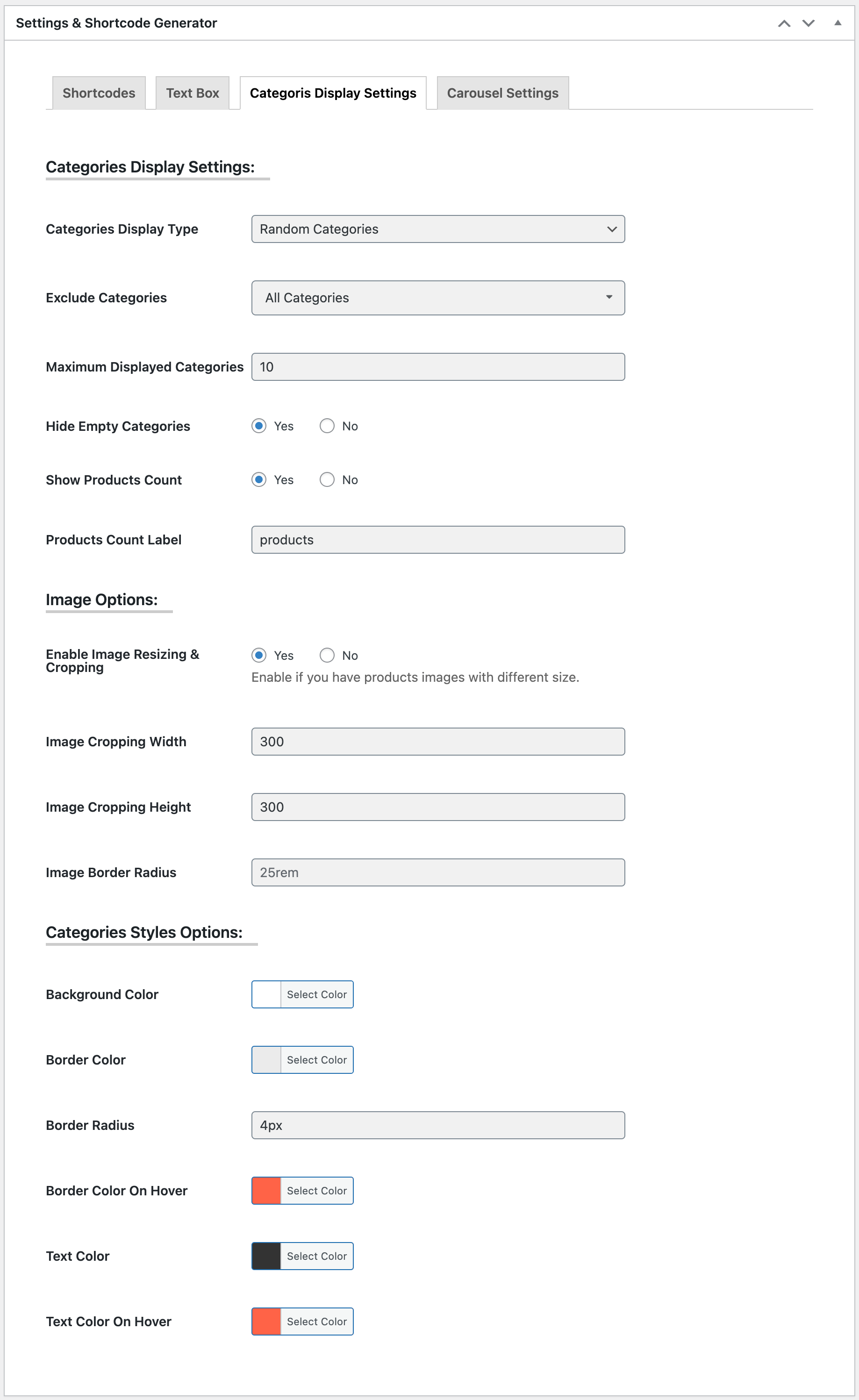
| Categories Display Settings: | |
| Categories Display Type | Selected categories, Random categories, Categories name A-Z and Categories name Z-A |
|---|---|
| Select Categories | If you selected 'Selected categories' option from above Categories Display Type, selected categories you want to show here. |
| Exclude Categories | Select categories you want to exclude if you selected 'Random categories/Categories name A-Z/Categories name Z-A' from above Categories Display Type. |
| Maximum Displayed Categories | Enter number of total categories you want to display if you selected 'Random categories/Categories name A-Z/Categories name Z-A' from above Categories Display Type. |
| Hide Empty Categories | Yes/No. |
| Show Products Count | Yes/No. |
| Products Count Label | Write Products Count Label. E.g. products |
| Image Options: | |
| Enable Image Resizing & Cropping | Yes or No. Enable if you have products images with different size. |
| Image Cropping Width | Enter the image width to crop. E.g. 350 |
| Image Cropping Height |
Enter the image height to crop. E.g. 350 |
| Image Border Radius | Enter CSS border radius in px/em/rem/%. Keep empty to disable. |
| Categories Styles Options: | |
| Background Color | Choose a color (from color picker) or add a color code for categories background color. |
| Border Color | Choose a color (from color picker) or add a color code for categories border color. |
| Border Radius | Add CSS border-radius in px/em/rem/% for categories box. |
| Border Color On Hover | Choose a color (from color picker) or add a color code for categories hover border color. |
| Text Color | Choose a color (from color picker) or add a color code for categories name and products count. |
| Text Color On Hover | Choose a color (from color picker) or add a color code for category name after hover on a category box. |
Configurable Options: Carousel Settings
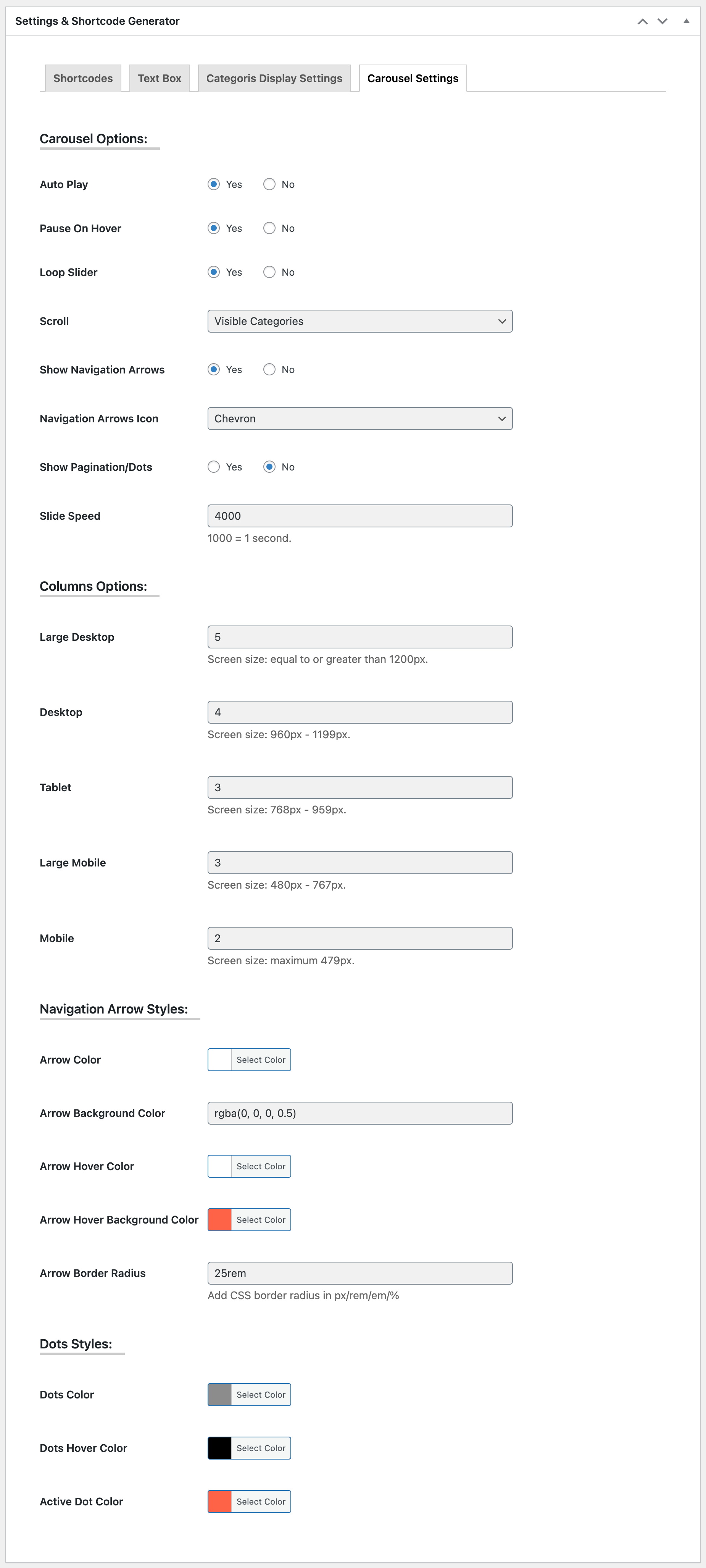
| Carousel Settings: (Carousel Options) | |
| Auto Play | Whether Auto play the carousel or not. |
|---|---|
| Pause On Hover | Whether Pause the Auto play on mouse hover or not if you enabled Auto play. |
| Loop Slider | If enabled, the carousel will keeps scrolling from first item again after reaching to the last item. |
| Scroll | Whether scroll one by one product or visible products on a single slide. |
| Show Navigation Arrows | Show/Hide navigation arrows. |
| Navigation Arrows Icon | Select an arrow type from Long Arrow, Chevron or Caret. |
| Show Pagination/Dots | Show/Hide slide pagination/dots. |
| Slide Speed | Enter Slide Speed in Milliseconds. |
| Columns Options: | |
| Large Desktop | Show number of products on single slide on Large Desktop view where screen size is equal to or greater than 1200px. |
| Desktop | Show number of products on single slide on Desktop view where screen size is 960px - 1199px. |
| Tablet | Show number of products on single slide on Desktop view where screen size is 768px - 959px. |
| Large Mobile | Show number of products on single slide on Desktop view where screen size is 480px - 767px. |
| Mobile | Show number of products on single slide on Desktop view where screen size is maximum 479px. |
| Navigation Arrow Styles: | |
| Arrow Color | Choose a color (from color picker) or add a color code for Navigation Arrows. |
| Arrow Background Color | Add a color code for Navigation Arrows Background. It's a text field, so you can add rgba(0, 0, 0, 0.4) color code for making the background slightly transparent if necessary. |
| Arrow Hover Color | Choose a color (from color picker) or add a color code for Navigation Arrows on hover. |
| Arrow Hover Background Color | Choose a color (from color picker) or add a color code for Navigation Arrows Background on hover. |
| Arrow Border Radius | Add CSS border radius in px/rem/em/% to make Navigation Arrows slightly or fully round. |
| Dots Styles: | |
| Dots Color | Choose a color (from color picker) or add a color code for Dots Color. |
| Dots Hover Color | Choose a color (from color picker) or add a color code for Dots Hover Color. |
| Active Dot Color | Choose a color (from color picker) or add a color code for Active Dots Color. |